
Valentina Pozzebon
portfolio

Valentina Pozzebon
Design System
TL;DR
Restructured 6 of 9 internal tools, designed 8 new components, optimized 12, and boosted adoption by 41% (resulting in 86% adoption across). Launched new documentation, weekly office hours, and aligned with Server-Driven UI, working closely with engineering, product ops, and content to scale consistently across teams and support faster, more reliable delivery.
@Careem
My role:
Product Design Lead
Team members involved:
1 Product Designer, 2 Product Managers, 3 Backend Engineers, 3 Frontend Engineers, 1 Architect, 2 Engineer Managers
Since:
December 2024
Problems
The design system was built to help teams stay aligned and move faster, but there are a few ongoing challenges that get in the way.
- Contributions sometimes go live incomplete or without notice, which causes bugs and confusion.
- There's no clear ownership, and we don’t always have enough people, time, or budget to keep things moving as they should.
- Documentation is either missing or not detailed enough, so teams often guess or ask around.
- Not everyone on the Design team is familiar with how to use or contribute to the system, which creates a learning gap.
- On top of that, workflows are inconsistent, and there's no clear QA or review process before changes go live, making it harder to scale and maintain the system over time.
What I Delivered

Component design and optimization
Led the end-to-end design of 8 new core components and improved 12 existing ones for better usability and performance.

System adoption and contribution workflows
Defined contribution workflows and increased adoption by 41%, improving how teams build, share, and use components.

Internal tool restructuring
Revamped 6 out of 9 Careem internal sites to reduce engineering effort and ensure cross-platform consistency.

Documentation and standards
Created a new documentation format including use cases, behavior, and content design, going beyond just technical specs.

Team support and alignment
Launched weekly Office Hours, onboarding sessions, and hands-on support (~10h/week) to guide contributors and align teams.

Scalability and flexibility
Aligned the system with Server-Driven UI architecture and ensured component flexibility for use cases like marketing campaigns.
Too much text ah? Let’s see some examples then
Note: projects are not fully included due to confidentiality.
I’ve included the following:
- Feature carousel
- Bottoms heets component and documentation revamp

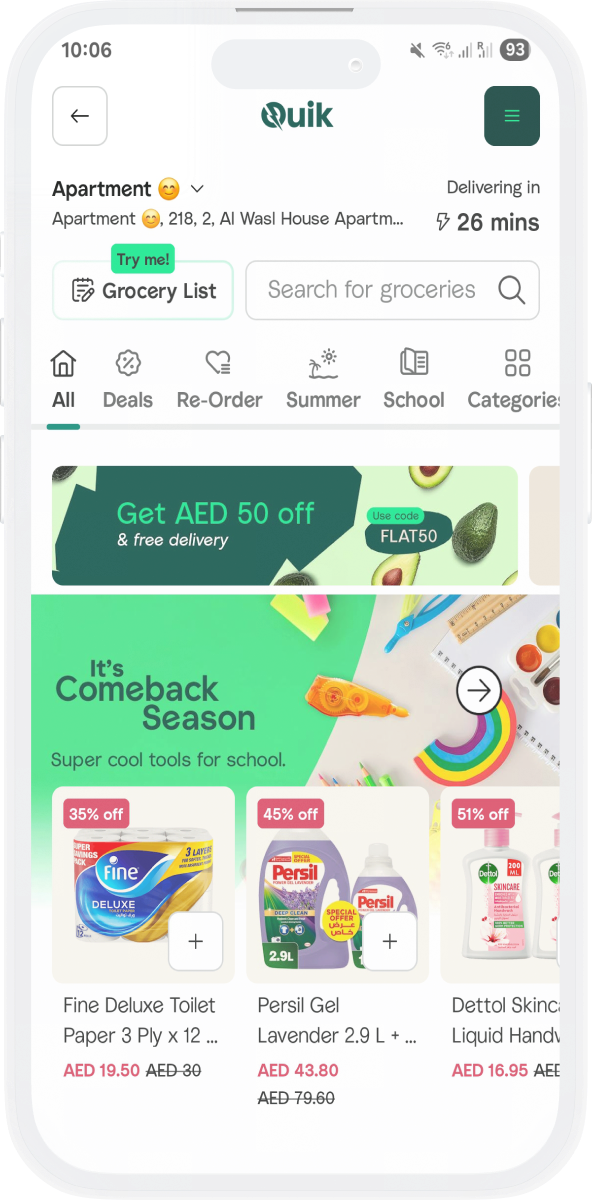
Feature carousel
New component
Problem statement
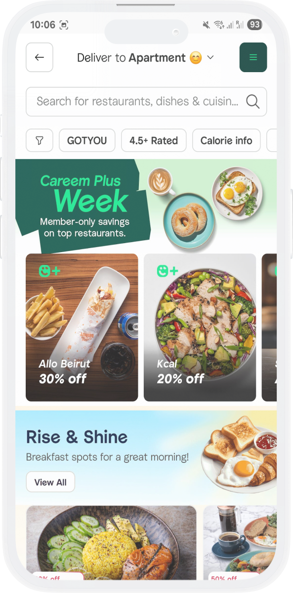
Teams across different verticals often need a flexible way to highlight key offerings, whether it's showcasing fresh products in Groceries, featured restaurants in Food, or special deals in Dine Out. However, existing solutions lacked consistency, scalability, and adaptability, making it difficult to maintain a cohesive experience across the platform.
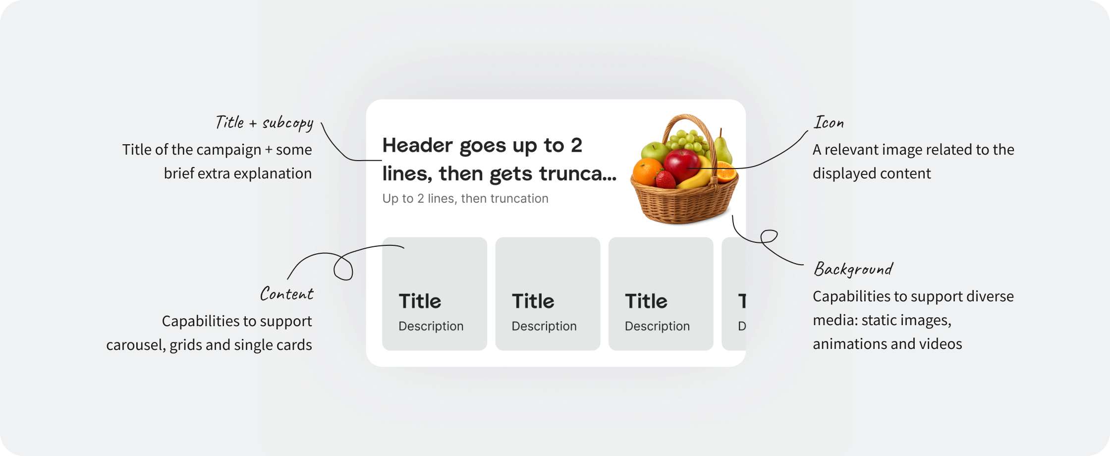
How this component solves it
Feature carousel is a flexible feature container that seamlessly adapts to different use cases. With a customizable header, value-driven table, and an interactive carousel, teams can effortlessly promote their initiatives while maintaining a unified experience. Originally introduced to highlight fresh products in Groceries, its adaptability makes it just as valuable for Food, Dine Out, and beyond, helping each vertical tell its story in an engaging and structured way.
Creative guidelines
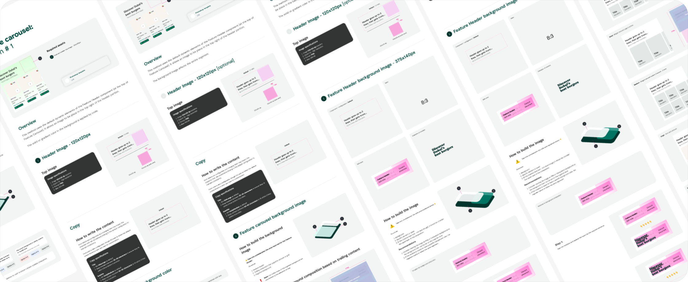
In-app use cases


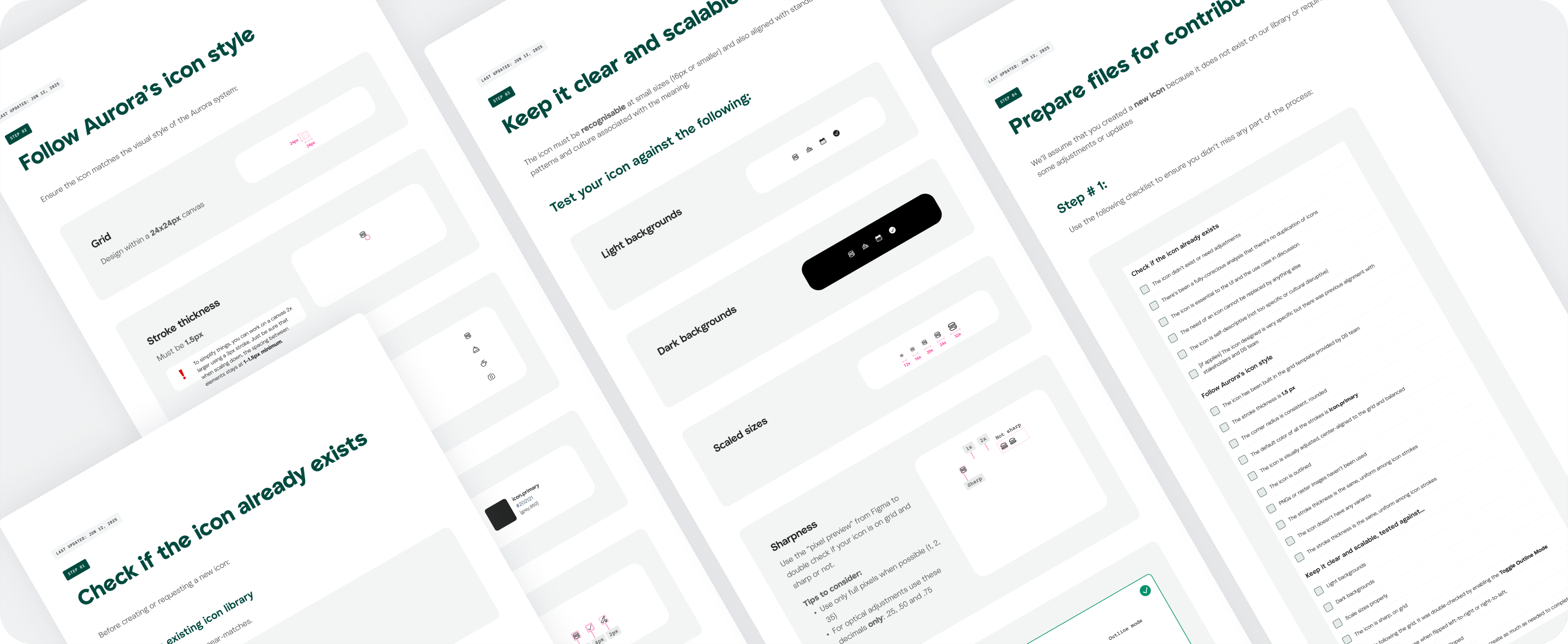
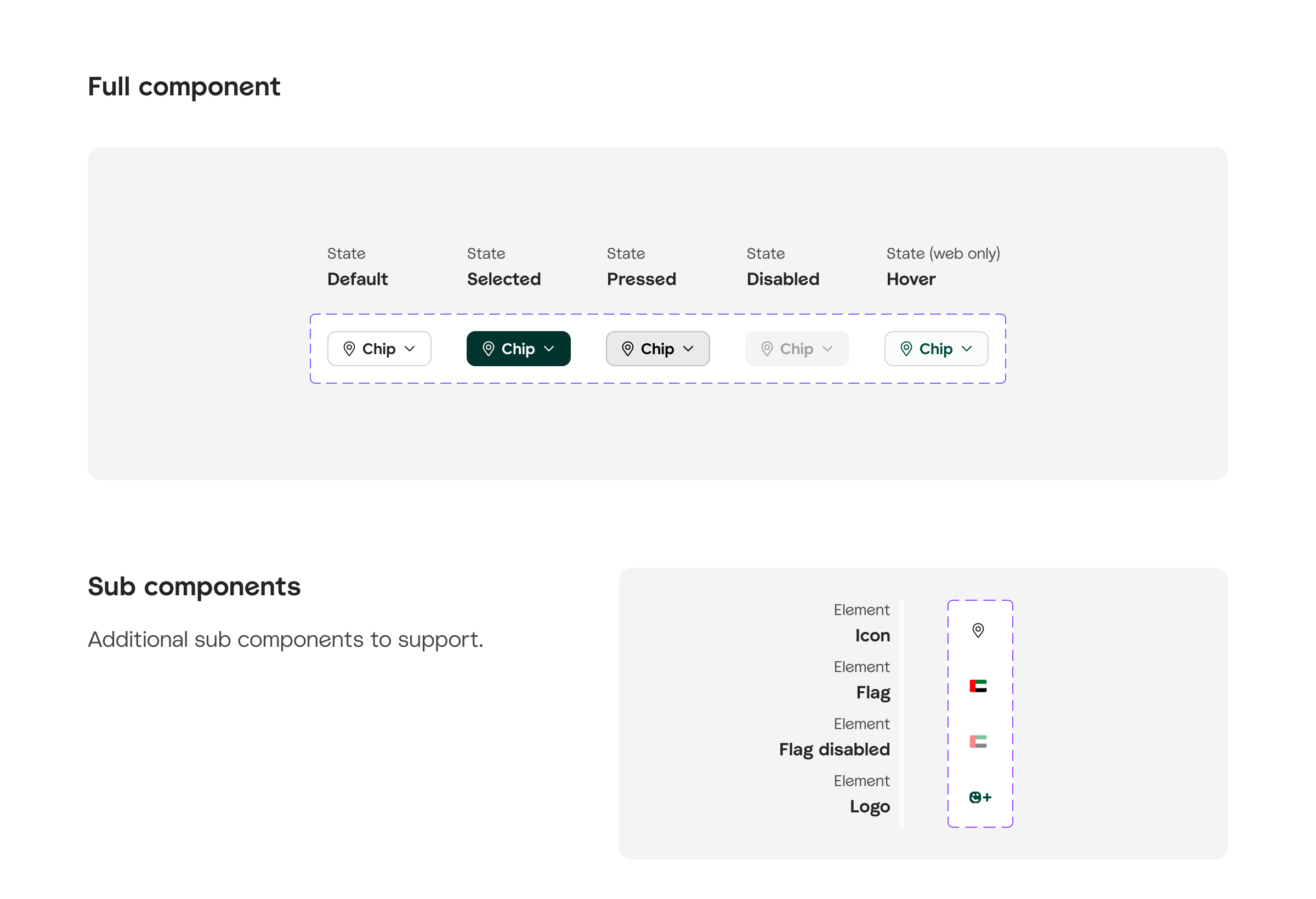
Bottomsheets component and documentation revamp
As part of improving the design system's scalability and usability, I contributed to structuring the technical documentation for core components, ranging from atoms and molecules to organisms, patterns, and templates. The goal was to create a consistent, practical reference that supports both designers and engineers, covering usage, behavior, content, and edge cases alongside the technical specs.
Before
After
My learnings
- Contribution workflows matter: Clear contribution and review processes are essential to avoid incomplete or misaligned components in production.
- Documentation drives adoption: Well-structured, practical documentation (including use cases and behavior) supports better usage and fewer questions.
- Scalability starts with structure: Establishing naming conventions, governance, and system logic early on helps scale more sustainably.
- Support is part of the system: Creating touchpoints like office hours or critiques builds trust, encourages contributions, and reduces friction.
- Cross-team alignment is ongoing: Regular syncs with engineering, product, and brand teams help prevent design drift and missed handoffs.
- Impact is measurable: Tracking adoption and contribution rates helped demonstrate value and secure buy-in for further investment.
- Design systems are never “done”: Continuous iteration, feedback loops, and optimization keep the system relevant and useful as the product evolves.
Want to know more about Design System daily routine? Let’s talk

Valentina Pozzebon

Download extended CV

2025

Valentina Pozzebon
portfolio
Valentina Pozzebon
Design System
TL;DR
Restructured 6 of 9 internal tools, designed 8 new components, optimized 12, and boosted adoption by 41% (resulting in 86% adoption across). Launched new documentation, weekly office hours, and aligned with Server-Driven UI, working closely with engineering, product ops, and content to scale consistently across teams and support faster, more reliable delivery.
@Careem
My role:
Product Design Lead
Team members involved:
1 Product Designer, 2 Product Managers, 3 Backend Engineers, 3 Frontend Engineers, 1 Architect, 2 Engineer Managers
Since:
December 2024
Problems
The design system was built to help teams stay aligned and move faster, but there are a few ongoing challenges that get in the way.
- Contributions sometimes go live incomplete or without notice, which causes bugs and confusion.
- There's no clear ownership, and we don’t always have enough people, time, or budget to keep things moving as they should.
- Documentation is either missing or not detailed enough, so teams often guess or ask around.
- Not everyone on the Design team is familiar with how to use or contribute to the system, which creates a learning gap.
- On top of that, workflows are inconsistent, and there's no clear QA or review process before changes go live, making it harder to scale and maintain the system over time.
What I Delivered
Component Design and Optimization
Led the end-to-end design of 8 new core components and improved 12 existing ones for better usability and performance.
System adoption and contribution workflows
Defined contribution workflows and increased adoption by 41%, improving how teams build, share, and use components.
Internal tool restructuring
Revamped 6 out of 9 Careem internal sites to reduce engineering effort and ensure cross-platform consistency.
Documentation and standards
Created a new documentation format including use cases, behavior, and content design, going beyond just technical specs.
Team support and alignment
Launched weekly Office Hours, onboarding sessions, and hands-on support (~10h/week) to guide contributors and align teams.
Scalability and flexibility
Aligned the system with Server-Driven UI architecture and ensured component flexibility for use cases like marketing campaigns.
Too much text ah? Let’s see some examples then
Note: projects are not fully included due to confidentiality.
I’ve included the following:
- Feature carousel
- Bottoms heets component and documentation revamp

Feature carousel
New component
Problem statement
Teams across different verticals often need a flexible way to highlight key offerings, whether it's showcasing fresh products in Groceries, featured restaurants in Food, or special deals in Dine Out. However, existing solutions lacked consistency, scalability, and adaptability, making it difficult to maintain a cohesive experience across the platform.
How this component solves it
Feature carousel is a flexible feature container that seamlessly adapts to different use cases. With a customizable header, value-driven table, and an interactive carousel, teams can effortlessly promote their initiatives while maintaining a unified experience. Originally introduced to highlight fresh products in Groceries, its adaptability makes it just as valuable for Food, Dine Out, and beyond, helping each vertical tell its story in an engaging and structured way.
Creative guidelines
In-app use cases
Bottom sheets component and documentation revamp
As part of improving the design system's scalability and usability, I contributed to structuring the technical documentation for core components, ranging from atoms and molecules to organisms, patterns, and templates. The goal was to create a consistent, practical reference that supports both designers and engineers, covering usage, behavior, content, and edge cases alongside the technical specs.
Before
After
My learnings
- Contribution workflows matter: Clear contribution and review processes are essential to avoid incomplete or misaligned components in production.
- Documentation drives adoption: Well-structured, practical documentation (including use cases and behavior) supports better usage and fewer questions.
- Scalability starts with structure: Establishing naming conventions, governance, and system logic early on helps scale more sustainably.
- Support is part of the system: Creating touchpoints like office hours or critiques builds trust, encourages contributions, and reduces friction.
- Cross-team alignment is ongoing: Regular syncs with engineering, product, and brand teams help prevent design drift and missed handoffs.
- Impact is measurable: Tracking adoption and contribution rates helped demonstrate value and secure buy-in for further investment.
- Design systems are never “done”: Continuous iteration, feedback loops, and optimization keep the system relevant and useful as the product evolves.
Want to know more about Design System daily routine? Let’s talk
Valentina Pozzebon
Download extended CV
2025
Valentina Pozzebon
portfolio
Valentina Pozzebon
Design System
TL;DR
Restructured 6 of 9 internal tools, designed 8 new components, optimized 12, and boosted adoption by 41% (resulting in 86% adoption across). Launched new documentation, weekly office hours, and aligned with Server-Driven UI, working closely with engineering, product ops, and content to scale consistently across teams and support faster, more reliable delivery.
@Careem
My role:
Product Design Lead
Team members involved:
2 Product Designers, 2 Product Managers, 3 Backend Engineers, 3 Frontend Engineers, 1 Architect, 2 Engineer Managers
Since:
December 2024
Problems
The design system was built to help teams stay aligned and move faster, but there are a few ongoing challenges that get in the way.
- Contributions sometimes go live incomplete or without notice, which causes bugs and confusion.
- There's no clear ownership, and we don’t always have enough people, time, or budget to keep things moving as they should.
- Documentation is either missing or not detailed enough, so teams often guess or ask around.
- Not everyone on the Design team is familiar with how to use or contribute to the system, which creates a learning gap.
- On top of that, workflows are inconsistent, and there's no clear QA or review process before changes go live, making it harder to scale and maintain the system over time.
What I Delivered

Component design and optimization
Led the end-to-end design of 8 new core components and improved 12 existing ones for better usability and performance.

System adoption and contribution workflows
Defined contribution workflows and increased adoption by 41%, improving how teams build, share, and use components.

Internal tool restructuring
Revamped 6 out of 9 Careem internal sites to reduce engineering effort and ensure cross-platform consistency.

Documentation and standards
Created a new documentation format including use cases, behavior, and content design, going beyond just technical specs.

Team support and alignment
Launched weekly Office Hours, onboarding sessions, and hands-on support (~10h/week) to guide contributors and align teams.

Scalability and flexibility
Aligned the system with Server-Driven UI architecture and ensured component flexibility for use cases like marketing campaigns.
Too much text ah? Let’s see some examples then
Note: projects are not fully included due to confidentiality.
I’ve included the following:
- Feature carousel
- Bottom sheets component and documentation revamp

Feature carousel
New component
Problem statement
Teams across different verticals often need a flexible way to highlight key offerings, whether it's showcasing fresh products in Groceries, featured restaurants in Food, or special deals in Dine Out. However, existing solutions lacked consistency, scalability, and adaptability, making it difficult to maintain a cohesive experience across the platform.
How this component solves it
Feature carousel is a flexible feature container that seamlessly adapts to different use cases. With a customizable header, value-driven table, and an interactive carousel, teams can effortlessly promote their initiatives while maintaining a unified experience. Originally introduced to highlight fresh products in Groceries, its adaptability makes it just as valuable for Food, Dine Out, and beyond, helping each vertical tell its story in an engaging and structured way.
Creative guidelines
In-app use cases
Bottom sheets component and documentation revamp
As part of improving the design system's scalability and usability, I contributed to structuring the technical documentation for core components, ranging from atoms and molecules to organisms, patterns, and templates. The goal was to create a consistent, practical reference that supports both designers and engineers, covering usage, behavior, content, and edge cases alongside the technical specs.
Before
After
My learnings
- Contribution workflows matter: Clear contribution and review processes are essential to avoid incomplete or misaligned components in production.
- Documentation drives adoption: Well-structured, practical documentation (including use cases and behavior) supports better usage and fewer questions.
- Scalability starts with structure: Establishing naming conventions, governance, and system logic early on helps scale more sustainably.
- Support is part of the system: Creating touchpoints like office hours or critiques builds trust, encourages contributions, and reduces friction.
- Cross-team alignment is ongoing: Regular syncs with engineering, product, and brand teams help prevent design drift and missed handoffs.
- Impact is measurable: Tracking adoption and contribution rates helped demonstrate value and secure buy-in for further investment.
- Design systems are never “done”: Continuous iteration, feedback loops, and optimization keep the system relevant and useful as the product evolves.
Want to know more about Design System daily routine? Let’s talk
Valentina Pozzebon
Download extended CV
2025